When you’re building your site, it’s easy to obsess over how it looks. Is that shade of pink perfect? Should the logo go on the left or right? While these design choices are important, they’re just scratching the surface. There’s so much more to think about behind the scenes when it comes to website best practices.

Image sourced from siteefy.com
Currently, there are around 1.1 billion websites out there in the world1. So, you need to make sure your site stands out and turns visitors into customers.
Not quite sure how to do this? Don’t sweat it. This complete guide will cover everything you need to know about ecommerce website best practices. Let’s get started.
Understanding Website Conversions
If you want to make your website work harder and generate conversions, you’re gonna need to understand what website conversions are in the first place.
A conversion happens when a visitor takes a desired action on your site. This could be anything from buying one of your products to signing up for your newsletter. The higher your conversion rate, the better your website is at getting visitors to take these actions.

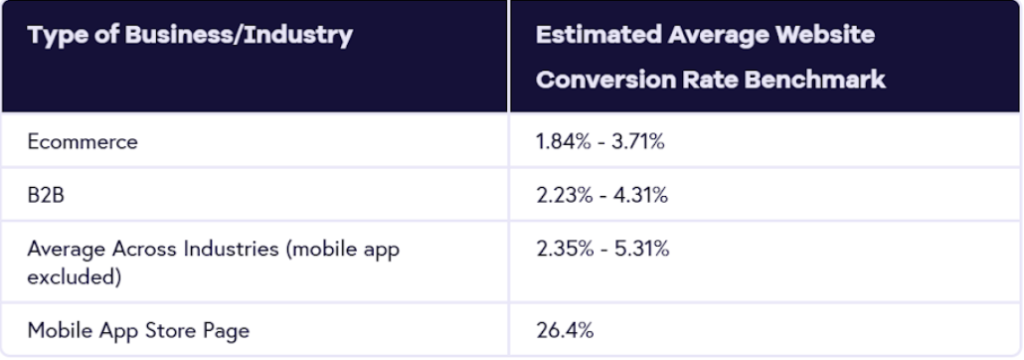
Image sourced from geckoboard.com
Now, what’s a good conversion rate? Well, that depends a lot on the industry, but on average, it’s around 2.35% to 5.31%2.
Website Best Practices to Follow
Now that you know what you’re aiming for, let’s get into our ecommerce website best practices that will improve your website and turn visitors into loyal customers.
You’ll want to make sure you’re following these website best practices:
- Choose the right domain name
- Simplify navigation
- Optimize page load speed
- Use clear and compelling CTAs
- Streamline the checkout process
- Leverage social proof
- Implement SEO practices
- Enhane mobile responsiveness
- Utilize data analytics
1. Choose the Right Domain Name
Picking a killer domain name is your first step, so you want to make sure you do it right! It should be memorable, punchy, and uniquely you. Here are some tips to nail it:
- Choose a domain extension that fits your brand (.com, .shop, etc.)
- Use keywords in your domain name search to boost SEO.
- Make it easy to pronounce and spell—no tongue twisters.
- Keep it unique and brandable to stand out.
- Avoid hyphens—they’re a buzzkill.
Porkbun Tip: Check out this complete guide on choosing a domain name in 2024 for more!
2. Simplify Navigation
Planning out simple, easy-to-follow navigation on your site is super important. You want visitors to land on your site and not get lost in landing pages upon landing pages. Here are a few website best practices to make sure your site’s navigation is simpler:
- Keep your main menu neat and easy to find (stick it near the top).
- Throw a navigation menu in the footer for good measure.
- Include breadcrumbs. No, not the kind you eat, but the ones that show users where they’ve been on your site.
- Place a search bar up top so people can type in what they’re looking for (think Google for your own site).
- Don’t overwhelm visitors with too many menu options on one page.
3. Optimize Page Load speed
Let’s talk about speeding up your website load time because no one likes waiting around. It’s one of Google’s core web vitals, which are essential factors Google takes into account to determine user experience on your site.
According to a 2023 report that analyzed over 4 billion web visits, the average website takes about 2.5 seconds to load on desktops3. But, on mobile devices, it’s a different story. We’re talking an average of 8.6 seconds. Not very fast at all.
The higher your load time, the higher your bounce rate (the percentage of people who leave your site immediately). To speed things up, get rid of the stuff you don’t need. Optimize your images and videos, minimize flashy animations, and use caching to store elements off your site so they load faster next time.
4. Use Clear and Compelling CTAs
Ever heard of the three C’s of copywriting? They stand for Clear, Concise, and Compelling.
When looking at your calls-to-action (CTAs), these three principles are your best friends.
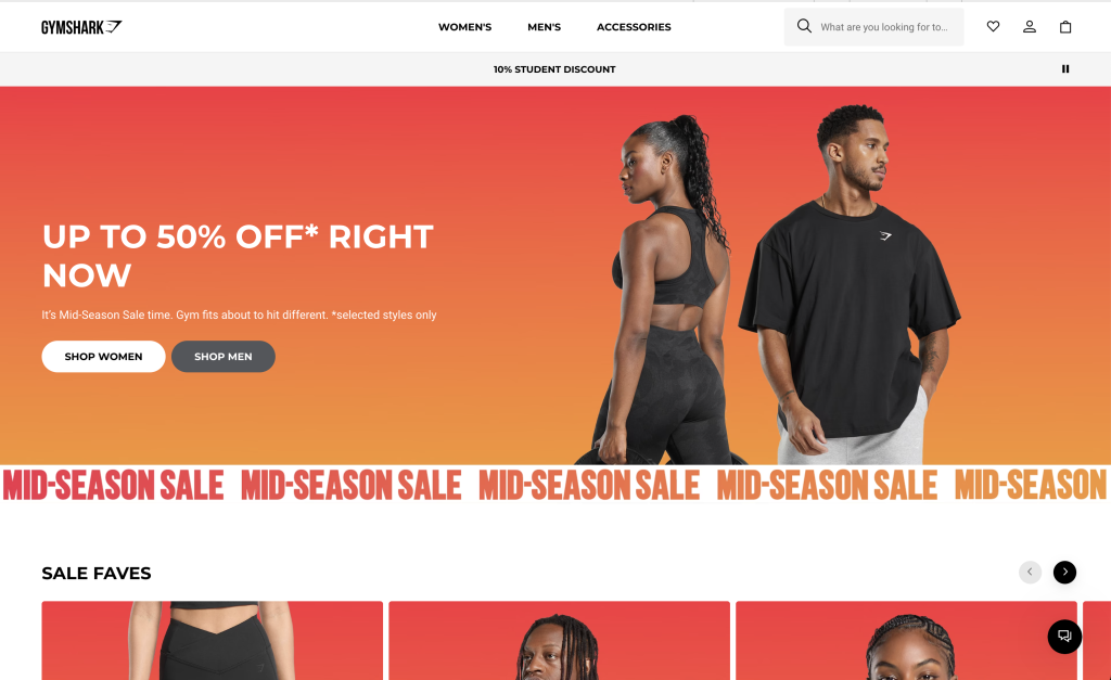
Your calls to action should be crystal clear, telling your visitors exactly what you want them to do. For example, Gymshark’s “Up to 60% off” followed by a “Shop women” button is straightforward. You know you’re getting a deal and where to click to start shopping for women’s products.

Screenshot sourced from Gymshark
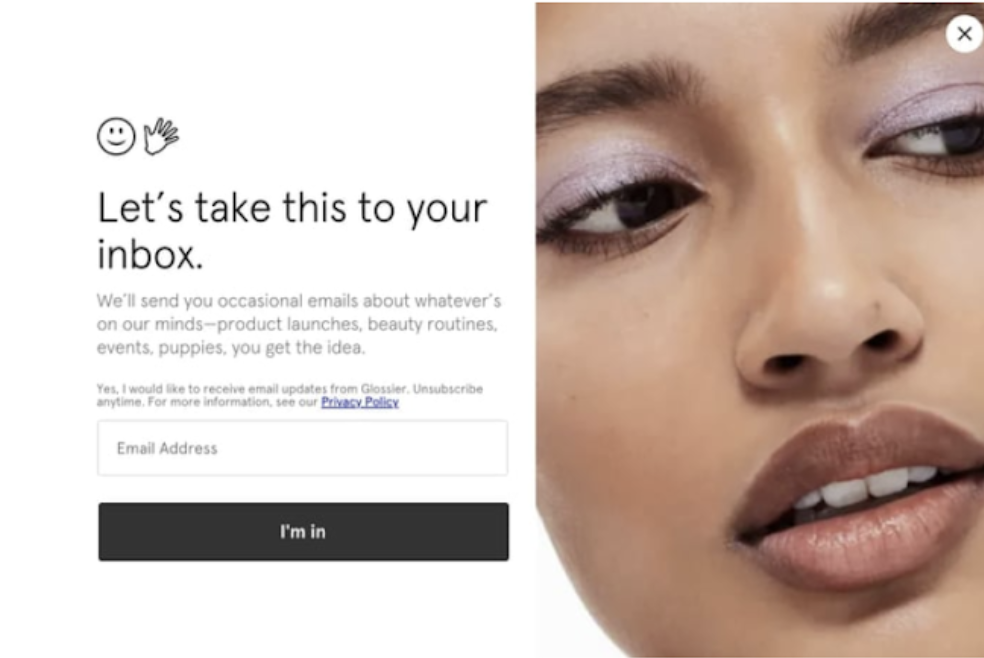
Keep CTAs short and snappy, too, so there’s no confusion. We recommend no more than seven words (but try to aim for five or fewer if you can). Glossier knows how to keep it short and sweet. “Let’s take this to your inbox” is their clever way of asking you to sign up for their newsletter. If you’re keen to join, simply click “I’m in” and you’re all set.

Image sourced from SEMrush.
And most importantly, make CTAs compelling—give people a reason they can’t resist clicking. You can do this by adding action verbs and power words that spark curiosity or urgency.
5. Streamline the Checkout Process
Imagine you’re at the grocery store. You’re ready to pay. All of a sudden, the cashier asks you for your phone number, email, favorite color, and star sign. You’d probably leave, right?
Online shopping is no different. A complicated checkout process can drive customers away faster than you can say “credit card”. Simplify your checkout at your online store by asking only for essential information (name, address, payment details), offering guest checkout options, and keeping it all streamlined. It’s a simple way to follow website best practices and increase total sales.
6. Leverage Social Proof
Who doesn’t love a good recommendation? Social proof makes you more trustworthy and attractive to others. Whether it’s customer reviews, testimonials, or endorsements from influencers, social proof shows potential customers that others have tried and loved your product or service.
Think about it. Would you rather buy from a brand with zero reviews or one with glowing testimonials and a solid five-star rating? Exactly.

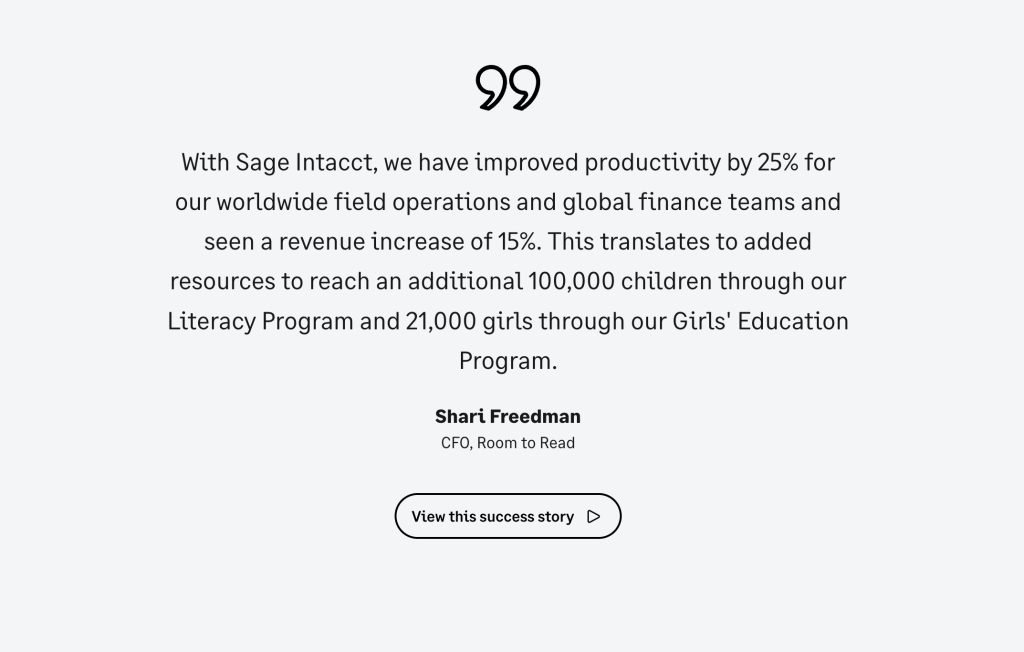
Image sourced from sage.com
Sage has a great example of this on their accounting software for nonprofit landing page. They use a quote from a prominent nonprofit leader who praises how their software has revolutionized their financial management.
7. Implement SEO Practices
You can’t have a list of website best practices for higher conversions without discussing SEO. Robust SEO practices involve optimizing your website with:
- The right keywords (in blogs, product descriptions, product listings, and product categories).
- Creating quality content that answers your audience’s questions.
- Earning backlinks from reputable sites.
- Having multiple domains to target different aspects of your business.
With effective SEO, you can boost visibility and attract organic traffic — people genuinely interested in what you have to offer. It’s all about getting your site to rank higher in search results because, let’s face it, no one scrolls to page 10 of Google.
8. Enhance Mobile Responsiveness
In the last quarter of 2023, around 59% of all website traffic came from mobile devices4. People are surfing and shopping on these smaller screen sizes more than ever.
Because of this, it’s essential that you make your website mobile-friendly. Google follows mobile-first indexing, which means it primarily uses the mobile version of your site for indexing and ranking. So it’s not just about looking good on a tiny screen (though that’s important too), you want your site to load fast and work smoothly without any issues.
Think big buttons, easy scrolling, and text that’s legible without having to squint. Your goal here is to give mobile users an enjoyable shopping experience so they’re not thinking, “Where’s the desktop version?”
9. Utilize Data Analytics for Improvement
Data analytics is another key element of website best practices as it helps you understand what’s working and what’s not. It shows you where your visitors are coming from, which pages they love (or hate), and where they drop off. This information is key for optimizing your website, improving your marketing, and boosting conversions.
Now, where do you get this data? Well, there’s a ton of places. You can gather it from tools such as Google Analytics, which tracks user behavior on your site, while social media metrics spill the tea on likes and shares.
If you’re an ecommerce business, you can also use retail business accounting software to view your best-selling items, track inventory trends, and learn about your customer buying patterns.
FAQ on Website Best Practices for Higher Conversions
A website conversion is when a visitor takes a desired action on your site, like making a purchase or signing up for a newsletter. The average conversion rate across industries typically ranges from 2.35% to 5.31%. The higher your conversion rate, the better your website performs at turning visitors into customers.
Focus on simplifying navigation, speeding up page load times, and using clear CTAs that tell visitors exactly what to do. Streamline your checkout process by asking only for essential information. Add social proof like customer reviews and testimonials to build trust with potential buyers.
Slow websites drive visitors away and hurt your conversion rate. The average desktop site loads in 2.5 seconds, while mobile takes 8.6 seconds. Faster load times are Google core vitals factors that also lower bounce rates and improve user experience.
A good CTA follows the three C’s: clear, concise, and compelling. Tell visitors exactly what you want them to do in seven words or fewer. Use action verbs and power words that create urgency or curiosity, and make buttons easy to spot and click.
Extremely important since over 60% of all website traffic comes from mobile devices. Google uses mobile-first indexing, meaning it primarily ranks sites based on their mobile version. Your site needs visible buttons, easy scrolling, readable text, and fast loading on smartphones and tablets.
Key Takeaways
So there you have it. Our complete guide to website best practices that’ll help you boost conversions and increase revenue.
Remember: keep those CTAs clear and compelling, streamline that checkout, and leverage social proof. And don’t forget to utilize data. Google Analytics and retail software are your new best friends.
With these tips, your website will be unstoppable.
Additional Sources
- https://siteefy.com/how-many-websites-are-there/
- https://www.geckoboard.com/best-practice/kpi-examples/website-conversion-rate/
- https://www.tooltester.com/en/blog/website-loading-time-statistics/#Website_Loading_Times_Statistics_And_Impact
- https://www.statista.com/statistics/277125/share-of-website-traffic-coming-from-mobile-devices

